Evolution of JenTekk Web Solutions
I was surfing through JenTekk's old site design folders and came upon the original site design - from back in 2001, and several others that followed.
They were experiments in color and style, but mostly reflected the fact that I really was still trying to find my own identity and my own personal website design style.
I will post them from the earliest to the latest, it has been quite the journey. Enjoy!
2001: JenTekk's first website – static

Not bad for a first try, but after a while I felt it was simply too blue.
2003: JenTekk's second site - full flash

My next design I wanted to implement more color, and a unique style. In addition I wanted to showcase my flash skills. This is what I turned out.
2005: JenTekk’s third site - static

Having wet my feet with brighter colors on the flash site, I decided to take it one step further. I opted for very vibrant colors (I think they actually scratched the retina's of one’s eyes) and an unconventional site layout & design. This site design borders on being obnoxious!
Each page of this site was another abusive color. I'm not sure if you noticed, but I had changed my logo as well. This site and logo wasn't going to last long. Most people either loved it or hated it, not a good thing.
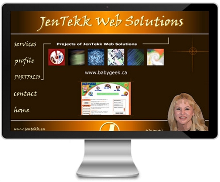
2006: JenTekk's fourth site - full flash portfolio

This flash website was made strictly to showcase my flash skills. I also wanted it to be very creative, and was actually quite happy with the way this site turned out, but I still hadn't secured my identity and brand with this project.
2007: JenTekk and Joomla 1.5 CMS website

Fortunately, after years of designing websites for other people, I started to get a feel for who JenTekk was, and who my target market was.
This website showed my own personal style and philosophy on site design, which is what I wanted to reflect as a brand... it was simple, vibrant, and professional. I felt I finally came up with a logo, a colour, a style, and a brand that I could be proud of and hang on to.
This site is clean, has a large band of vibrant color, with subtle hues of the same color (in the menu, footer and page titles) to add some life. The different images in the header added some interest without being over-the-top, and used to enhance the message of that particular page.
When it was time to update my website design I knew it wouldn't be too different from this one.
2012: JenTekk and Joomla 2.5 / 3.3 CMS responsive template

Not being one to fall behind, I upgraded my Joomla installation to Joomla 2.5 (and recently to 3.3) and gave my template a more modern and clean look & feel and made sure it was mobile-friendly. It was also time to freshen up my content and reconsider my slogan.
To the home page, I added a three image slideshow which gave it some life. I also wrote three brief introductions to inner pages to entice clients further into the website. For SEO purposes I was sure to add a brief introduction to Joomla - our specialty.
In addition to the new design, the new site includes newly created "Case Studies", "Web Design Gallery", "Testimonials" and "Jen of JenTekk" page. I also migrated my Blog from a separate WordPress platform to my current company website, adding a social media sharing extension.
With lots of positive feedback on the latest site design and recently added content I'm confident that we've definitely taken another leap forward. Keeping up with the times takes a little bit of effort but well worth it. A brand new shiny site: priceless.
2015: JenTekk and YOOtheme's Joomla Peak template

In 2014 I came across the YOOtheme template developers while searching for a new Joomla template provider. Immediately I appreciated YOOtheme's template designs. They were modern, clean and beautiful. I promptly purchased the YOOtheme's Peak template built on the popular Warp Framework, and customized it with JenTekk brand colours and the rest is history. The template layout was ahead of its time and is still highly functional today.
Posted in Before & After


